Falling Down the Thames Blog 5, 16th April 2014
Two Friends A River An Adventure
When Glen and I first started talking about Falling Down the Thames, we pictured the aquatic voyage itself. But those thoughts quickly expanded into peripheral activities and by-products. We decided with excitement that we needed a logo. “Surely we can’t do a source-to-sea adventure without a logo!” we exclaimed.
That’s all well and good, but how does one go from “We want a logo for our trip!” to the fully finished design?
Fortunately I had already been through this process for some other businesses I am involved in. I knew that we could begin with a general concept (i.e. an abstract idea) or we could start with tangible elements that we wished to be included in the logo. Or we could go with a bit of both.
Glen and I wanted our logo to evoke a sense of adventure, while reflecting the natural history of the River Thames. We agreed that the logo should be simple; even minimalistic. The graphics should be stylized, rather than highly detailed. Less is more.
I contacted Angela Wagner, graphic artist and owner of Inspired Design, a Toronto-based graphic design studio. Angela and I had previously worked together on the design of three other logos for my veterinary and outdoor gear businesses. From the creativity and quality of her earlier work, I was confident that she would come through for us on Falling Down the Thames.
Glen and I discussed our ideas for the content. We both wanted the River Thames to be depicted. A canoe or, at the very least, a paddle would also make sense. “Finally,” Glen added, “we should include a kingfisher. It is important to reflect the local fauna.”
We approached Angela with these ideas. Her feedback was enthusiastic, as she explained that the more clear and precise we could be about the content of a logo, the easier it would be for her to work. “Some clients,” she said, “only know conceptually what they want, while others can tell me such high level details as wanting the design to show a dog balancing on an exercise ball.” We fell into the latter group.
It was not long before we received our first round of logos. A swishing blue flow of the Thames, over a stylized kingfisher, all in bright happy colours. Below were the words: Canoe. River. Birds. Two Friends. Angela explained that in attempting to accommodate images of each of our requested components on one logo, the design quickly became crowded and unsightly. So she used her creative license and incorporated a tagline for the parts not visualized. Brilliant.
Our vision was coming to life. It was taking form, and we could not be more excited. But this was just the first draft. As great as it looked, certainly we couldn’t stop at the first draft. There must be ways to make it even better.
Glen and I sat at a bistro table in a downtown Toronto Starbucks and stared at the logo over lattes.
“We’re paddling from west to east, so let’s show the river starting as a narrow trickle on the left and widening on the right.”
“The viewer might not know that the colourful swish is meant to be a kingfisher. Let’s make him a bit more detailed.”
“The kingfisher would look energetic and determined if shown in flight. Let’s make him fly from west to east.”
“Let’s consider other words for the tagline.”
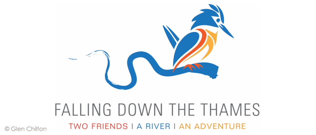
We sent these thoughts to Angela. Off she went again, armed with our requests for modifications. A few weeks later we received the following:

While Angela’s kingfisher is stationary rather than in flight, he had an air of adventure and determination. We immediately adored both designs. We could easily picture the blue block introducing a video clip. The stylized kingfisher on a river branch could appear on clothing, a flag, perhaps bookmarks. The opportunities seemed endless…
The graphic identity of Falling Down the Thames was born.
- Krista

